A few comments from my use of the Discourse site so far:
-Not sure whether the current existing set of smilies will carry over into whatever iteration the forum may take. I think smilies are an integral part of the forum. There’s a lot of banter, teasing, joking around on the forum. In my view, smilies are an integral part of aiding users convey tone in their messages. And while emojis can in part serve some of that, I feel like there are certain smilies that Berserkers love and often use. Not sure if I’m the only one, but I’ve found myself at times looking for an emoji while texting someone, only to remember that the ‘emoji’ in question is really a smilies on Wine Berserkers. I feel like there are some that almost feel like they are a part of the forum’s DNA. If there’s a way to keep them, or at least some most frequently used, I feel like that’d be great. ![[flirtysmile.gif] flirtysmile](/uploads/db3686/original/2X/c/ce2642e7caade9035e3a3b13c8b8d2b3ddb2b4c9.gif)

![[neener.gif] neener](/uploads/db3686/original/2X/3/3bd35321ffd7ed2243d1d518ebb606d554360600.gif)
![[new-here.gif] newhere](/uploads/db3686/original/2X/4/4f12a4e22d562f86ca4e3d18cc0affcfb2516fa8.gif)
![[stirthepothal.gif] [stirthepothal.gif]](/uploads/db3686/original/2X/f/f40faec63ca1018898a40805efbf9f0066a3d205.gif)
![[swearing.gif] [swearing.gif]](/uploads/db3686/original/2X/8/8a0d3f3461d40641d294442fc2be78039bf94d19.gif)
![[dead-horse.gif] deadhorse](/uploads/db3686/original/2X/4/45ee00f19fd423bce6eecc141248be5543b2c8bc.gif)
![berserker [berserker.gif]](/uploads/db3686/original/2X/8/8600bbd4810d342b8fbd4ffb62b4f0026275fd37.gif)
The reactions are emoji-based, so every emoji that every mobile device has can be implemented as a reaction. I have found that we CAN introduce custom emojis, including the berserker, for example. Reactions are a bit more limited, as they should be, but the smilies/emoji are endless - you’ve probably seen the massive list, it’s all the ‘standard’ ones from every mobile device, very extensive, but we can add our unique ones.
-Really like the wider set of reactions outside of just like. If it’s possible to customise them, I think avoiding the ability to react with negative reactions would be good. Berserkers can be fairly opinionated people as it stands, adding in a feature where they can ‘dislike’ something certainly has the possibility to allow for unnecessary pile-ons or making reticent users feel unwelcome.
Yes, fully customizable, the list is the same as with adding emoji/smilies - I added the angry one as I also wanted the ability to show ‘dislike’ that way. This can easily be done with input from the community on which to choose, which are needed
-Different colour user banners. The current site has different colour banners for different user types, GCC, MC, Berserker Business, mods, etc. Curious to know how that will work in the new system. I always like noting who’s a Berserker Business and checking out their business if I haven’t already. Would be nice to continue that feature in someway to continuously highlight those Berserker Businesses that both support the site and post here.
Will have to check into this, and see if JulianD has some insight - he’s been amazing in this setup process
-Probably verging into curmudgeon territory on this one, but I do miss inline signatures in the current trial Discourse system. I find it often has useful information on it, especially when it notes when someone may be ITB and where they may work.
Yes, I’m accustomed to it as well, but I understand the desire to de-clutter. It’s an adjustment, and it’s very easy to check someone’s info with a click of the username icon, which also has more information than just a signature, and doesn’t force you to go to a new page like viewing someone’s profile here - it just opens it up right there for you, expanding the info easily
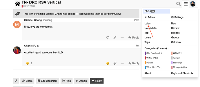
-The unread topics feature works slightly differently than the current system. It seems to only show unread topics which a user has interacted with, and not all unread topics. The current version of unread topics that displays all unread posts is usually my preferred way to browse Berserkers. It allows me to see which topics have been added or posted on since I was last online. I can then mark everything else as read and rinse and repeat. Maybe I’m a fringe case of using it like that, but I found that method helpful in keeping up with topics that interest me, both new and ongoing. Not sure if there’s a way around this in Discourse.
You want to click ‘Latest’, that’s our ‘unread topics’ here, shows every post made, in order, that you haven’t seen. Unread is, as you said for those topics you’ve participated in or already read. Also, the ‘last visit’ bar shows up for any thread you’ve already been in, showing a graphical divider between what you’ve already read/seen and what is new - super helpful


